
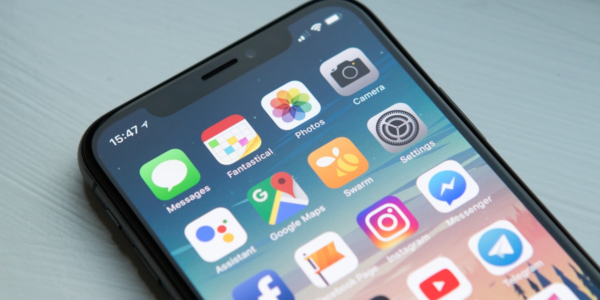
If you design for mobile, you design for both iOS and Android. Here's everything you need to know about the key design decisions.
Navigation patternsiOS lives in tabs at the bottom. Android lives in navigation drawers and bottom navigation. The key insight: both platforms have converged on bottom navigation as the primary pattern for consumer apps, but the back button behaviour is fundamentally different.
Type scaleiOS uses San Francisco. Android uses Roboto. Neither can be overridden meaningfully. Design your type hierarchy to work with the system font, not against it.
Gesture navigationiOS has had gesture navigation since 2017. Android has had it since 2019. Both platforms have effectively eliminated the navigation bar for most use cases. Design for swipe-from-edge navigation on both.
The home indicator (iOS) and navigation bar (Android)Both platforms have a persistent element at the bottom of the screen. Account for it in every full-screen experience. Ignoring it produces janky UIs that clip content.
Material You vs Human Interface GuidelinesThe philosophical difference: Material You is more prescriptive and component-driven. HIG is more principle-driven. Material You assumes you're using Android's components. HIG assumes you're building native.
The practical adviceDesign for one platform first and adapt. Start with iOS if your target demographic is urban, premium. Start with Android if your target is broader Indian market (75%+ of Indian smartphones are Android).


Comments (0)